The Chroma Factor: Labels in Very Peri
Hub Labels is pleased to announce the monthly series, “The Chroma Factor”. The series will feature a new color each month to inspire your next label design. In addition, The Chroma factor members will receive color swatches, label samples, and tips on designing with the featured color.
Want to learn more about The Chroma Factor Monthly Subscription? Become a member today!
Introducing Very Peri
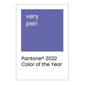
The Chroma Factor’s first color choice aligns with Pantone’s Color of the Year program. Pantone announced a brand new color called “Very Peri” as their Color of the Year for 2022. Creating a new color for the annual program was a first for Pantone, a company best known for its color matching platform.
The purple hue is both warm and cool. As a result, the color captures the transformation society is going through as we enter a new year. The blue tones offer reassurance and comfort. In addition, the violet-red undertones add vibrancy to the color that inspires creativity. The result – A vibrant, periwinkle blue with a “carefree confidence” and “daring curiosity.”
Leatrice Eiseman, the executive Director of the Pantone Color Institute, presented her thoughts on the new color. “As we move into a world of unprecedented change, the selection of PANTONE 17-3938 Very Peri brings a novel perspective and vision of the trusted and beloved blue color family, encompassing the qualities of the blue, yet at the same time with its violet-red undertone. PANTONE 17-3938 Very Peri displays a spritely joyous attitude and dynamic presence that encourages courageous creativity and imaginative expression,” Eiseman said in a statement.
Pantone believes Very Peri will be a visually striking color for many industries in 2022. Expect to see Very Peri in industries including apparel, beauty, product design, packaging, and labels.
Label Design with Very Peri
As a new color, extra steps need to be taken to ensure the Very Peri color matches expectations when printed. As a result, label designers should know how to identify a label printer with the technology to color match.
First, be sure your label manufacturer prints in extended gamut. Additionally, industry color matching certifications, such as the G7 and GMI certifications, prove a custom label printers ability to color match. Finally, be sure to ask your label printer to run a color match test, also known as an ink drawdown, to get the color expected. Pantone PMS spot colors can also be used.
Coated Label Material Best Match of Very Peri
Pantone colors are designed to work across various industries from textiles to label materials but ink color formulas will change depending on the medium. As a label converter, our customers reference the formula guides for coated and uncoated papers. Our extended gamut capabilities allow us to color match with more precision.
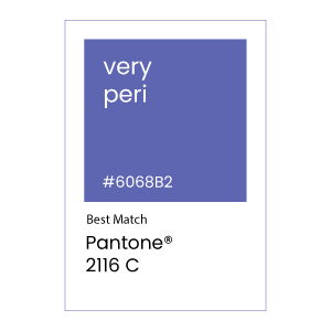
To match the Very Peri color, Pantone recommends Pantone 2116 C as a best match solution. This recommendation is based upon Pantone’s Formula guide for spot color ink on coated paper. Discuss your specific color demands with your professional label manufacturer.
Analogous Colors of Very Peri
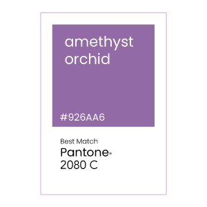
Analogous colors in art is defined as colors that near each other on the color wheel.
Complementary Color of Very Peri
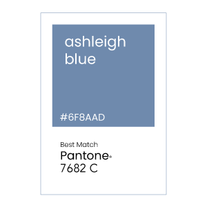
A complementary color is on the opposite side of the color wheel and results in a white or black when combined with its complementary color.
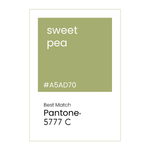
For more color palettes inspiration, visit Pantone’s website or create your own palette at Pantone Connect.
Join The Chroma Factor mailing list
Want to see label samples featuring the Very Peri color? Become a member today and receive The Chroma Factor monthly subscription of the latest color palettes, swatches and label designs.
