The Chroma Factor: Labels in Crimson Red
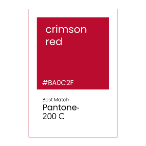
February’s feature color for “The Chroma Factor” series is Pantone 200 C, a deep blueish-red color that is part of the crimson red family. We picked Pantone 200 C for February to celebrate Valentine’s Day. Also, besides being the month of love, February is American Heart Month. This deep red was the natural choice to highlight this February.
Before we being, don’t forget to join “The Chroma Factor” monthly subscription box by becoming a member today!
INTRODUCING Pantone 200 C
Pantone 200 C is a crimson red that is rich and deep. This red has a slight blue hue, adding to the color’s depth. While reds with yellow appear are seen as cheerful and warm, their red-blue counterparts are dramatic and spark emotion. Deeper reds are also easier on the eyes. As a result, Pantone 200 C is popular when printing labels and packaging. It can appear cool when placed next to a warm color such as orange but can also appear warm when placed next to a blue.
Deep reds are found throughout nature in birds, insects, and flowers. For example, the crimson sunbird and crimson rosella parrot are both visually striking species. The deep red feathers of males are visually appearing and attract the attention of females while courting.
In society, any cultures view red as a color of passion and power. It is visually stunning and an attention grabber. Often associated with fire, rubies and blood, crimson demands attention and elicits a powerful primal response.
LABEL DESIGN WITH Pantone 200 C
Labels designed with Pantone 200 C may find more success with a less is more approach. Black, white, gold and silver are popular choices when a primary label features a deep red. These secondary colors cause the label to stand out and add sophistication to a finished product. Interestingly, blue-red such as the Pantone 200 C, are more attractive to the upper class market compared to their orange-red counterparts which appeal to the working class. Know your target audience and don’t dilute your messaging with too many colors.
Color can also be linked to flavor. A crimson red can be linked to hot and spicy flavors. Red has also been tied to increasing appetite and a rise in metabolism, making it a popular choice for the food industry.
COATED LABEL MATERIAL for Pantone 200 c
Be sure to talk to your label printer about your exact color demands. Label print manufacturers with a G7 and GMI certification are considered experts at color matching to ensure you get the color you need for your label project.
Our label recommendations are based upon the Pantone formula guide for spot color ink on coated paper. Discuss your specific color demands and label materials with your professional label manufacturer.
Monochromatic COLORS OF Pantone 200 c
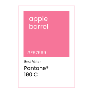
Monochromatic colors in art are defined as the use of many shades, tones, and tints of a single color. Using monochromatic colors attract attention and provide focus to a label design.
COMPLEMENTARY COLOR OF Pantone 200 c
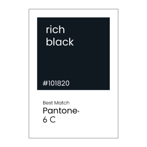
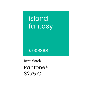
A complementary color is on the opposite side of the color wheel and results in a white or black when combined with its complementary color.
Other Label Considerations
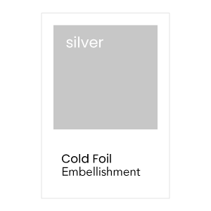
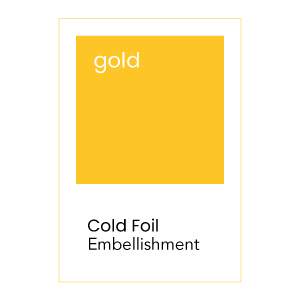
Implementing cold foils can create a striking and dramatic result in your printed label.
For more color palettes inspiration, visit Pantone’s website or create your own palette at Pantone Connect.
JOIN THE CHROMA FACTOR MAILING LIST
Want to see label samples featuring Pantone 200 C? Become a member today and receive The Chroma Factor monthly subscription of the latest color palettes, swatches and label designs.
