The Chroma Factor: Labels in Island Fantasy
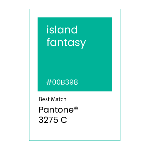
The March feature color for “The Chroma Factor” series is Pantone 3275 C, a medium dark shade of cyan. We picked Pantone 3275 C for March to celebrate the anticipation of spring. With the return of green leaves and blue skies, Island Fantasy is the perfect color for the changing season.
Before we being, don’t forget to join “The Chroma Factor” monthly subscription box by becoming a member today!
INTRODUCING Pantone 3275 C
Pantone 3275 C is a blue green that can be cool when placed next to blues or warm when placed next to oranges. A versatile color, it is a reminder of better things just on the horizon.
Don’t expect to find the bluish-green shade of Island Fantasy in nature, though it does lend itself to the color of the Caribbean. When the Island Fantasy color does appear in nature, it is usually for a moment. One moment you may think you are looking at blue and the next, a shade of green as light dances around. This creates a subtle, but complex feeling of depth, warmth and excitement.
In society, green represent harmony through acceptance, wealth, and nature. Furthermore, blue represents perfection through knowledge, success, and security. By combining these two colors, we get a vibrant color full of hope and promise.
LABEL DESIGN WITH Pantone 3275 C
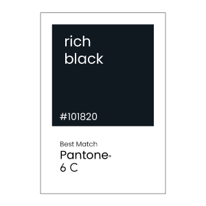
Such a dramatic color will appear vibrant when printed on your next label project. To ensure a designer does not visually overwhelm a consumer, consider a limited palette and the use of a Rich Black, such as Pantone Black 6 C or the use of Digital White or a white substrate.
Gradients and monochrome palettes are great choices when designing this Island Fantasy to add complexity to a label without overwhelming the design with too much contrast. By introducing shades or tints, you limit the color palette but introduce some variation.
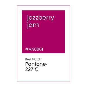
If you want to really draw attention to your label design, consider adding red or dark pink, such as Pantone 227C Jazzberry Jam. Reds and pinks are opposite on the color wheel and will pop on a store shelf. Just be careful not to overuse.
Color can also be linked to health. Pantone 3275 can be linked to wellness, nature, and cleanliness. By introducing blues and greens into your label design, you can align your product and brand messaging with your consumer’s habits and personal goals.
COATED LABEL MATERIAL for Pantone 3275 c
As discussed in earlier editions, be sure to talk to your label printer about your exact color demands. Label print manufacturers with a G7 and GMI certification are considered experts at color matching to ensure you get the color you need for your label project.
Our label recommendations are based upon the Pantone formula guide for spot color ink on coated paper. Discuss your specific color demands and label materials with your professional label manufacturer.
Split complementary COLORS OF Pantone 3275 c
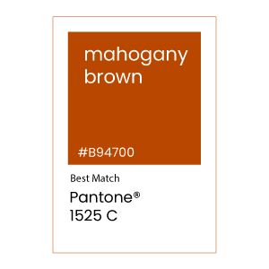
Split complementary colors in art are defined as a mixture of two opposite colors on the color wheel. Using split complementary colors for a versatile and pleasant color scheme. In addition, many designers find this color scheme easier to work with as the hues are more subtle and create less tension than a complementary color.
Monochromatic Colors of Pantone 3275 C
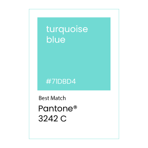
A Monochromatic color scheme will include shades and tints of the original color. Monochromatic colors are harmonious and create a cohesive look. It doesn’t draw attention to itself and will let your content shine and provide focus, while creating a memorial impression of your brand color.
For more color palettes inspiration, visit Pantone’s website or create your own palette at Pantone Connect.
JOIN THE CHROMA FACTOR MAILING LIST
Want to see label samples featuring the Very Peri color? Become a member today and receive The Chroma Factor monthly subscription of the latest color palettes, swatches and label designs.
