The Chroma Factor: Labels in Volcanic Glass

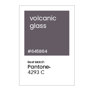
The April feature color for “The Chroma Factor” series is Pantone 4293 C, a balanced dark gray. We picked Pantone 4293 C for April as it can be paired with most colors to create amazing contrast. From Easter pastels to bold primary and secondary colors, volcanic gray provides perfect balance to label design. Gray tends to take a back seat, so this month we want to put the spotlight on this versatile color.
Before we being, don’t forget to join “The Chroma Factor” monthly subscription box by becoming a member today!
INTRODUCING Pantone 4293 C
Pantone 4275 C is a gray that upon further examination, is actually a dark shade of magenta, though it also contains almost equal parts of green and blue.
Within nature, you can find this shade of gray in granite, the bark of trees, or in mountainous peaks. While people are drawn to bright colors, pairing those colors next to a gray can offer a dramatic contrast. In all its muted beauty, gray offers mystery, confidence, and complexity to any label design.
In society, dark gray represents strength and sophistication. It lacks the negativity of black. Furthermore, gray is a diplomatic color and not a color of extremes. Refined, dignified, elegant and authoritative – Pantone 4275 strikes the perfect balance to pull together your next label design.
LABEL DESIGN WITH Pantone 4293 C
Gray is a wonderful color to pair with various colors on the color wheel. This makes it an ideal choice when you need multiple label skus but need to tie all your label designs together to create a cohesive look.
Dark gray is not a popular choice for food and agriculture. Furthermore, avoid a palette that is completely monochrome. Too much gray can be seen as depressing and dull, so it’s important to strike the right balance within a label design. However, by pairing with vibrant colors, you create an unforgettable look that is memorable, while also communicating sophistication and class.
COATED LABEL MATERIAL for Pantone 4293 c
As discussed in earlier editions, be sure to talk to your label printer about your exact color demands. Label print manufacturers with a G7 and GMI certification are considered experts at color matching to ensure you get the color you need for your label project.
Our label recommendations are based upon the Pantone formula guide for spot color ink on coated paper. Discuss your specific color demands and label materials with your professional label manufacturer.
Go Bold with Pantone 4293 c
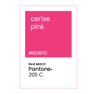
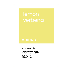
When designing with Pantone 4293 C, less is more and go bold with a splash of color. Consider adding Cerise Pink or Lemon Verbena into your label design. Also consider adding other dark colors or shades such as a Feld Grau or Old Bamboo.


Monochromatic OF Pantone 4293 c
A Monochromatic color scheme will include shades and tints from your original color. Monochromatic colors are harmonious and create a cohesive look. It doesn’t draw attention to itself and will let your content shine and provide focus, while creating a memorial impression of your brand color. We do recommend considering a splash of color in your label design to really grab the consumer’s attention.

For more color palettes inspiration, visit Pantone’s website or create your own palette at Pantone Connect.
JOIN THE CHROMA FACTOR MAILING LIST
Want to see label samples featuring the Very Peri color? Become a member today and receive The Chroma Factor monthly subscription of the latest color palettes, swatches and label designs.
